Label Refresh
Label Design • Branding
Project Goals: Refresh an existing beverage design

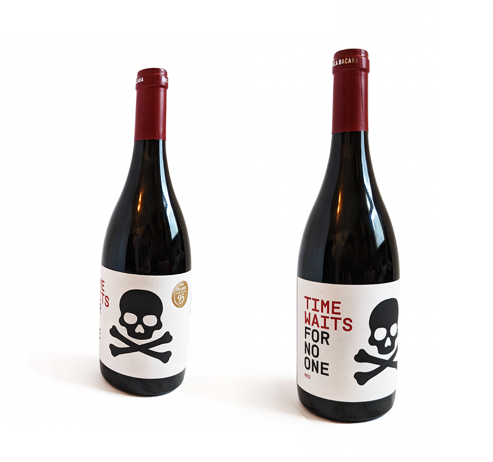
Original Label

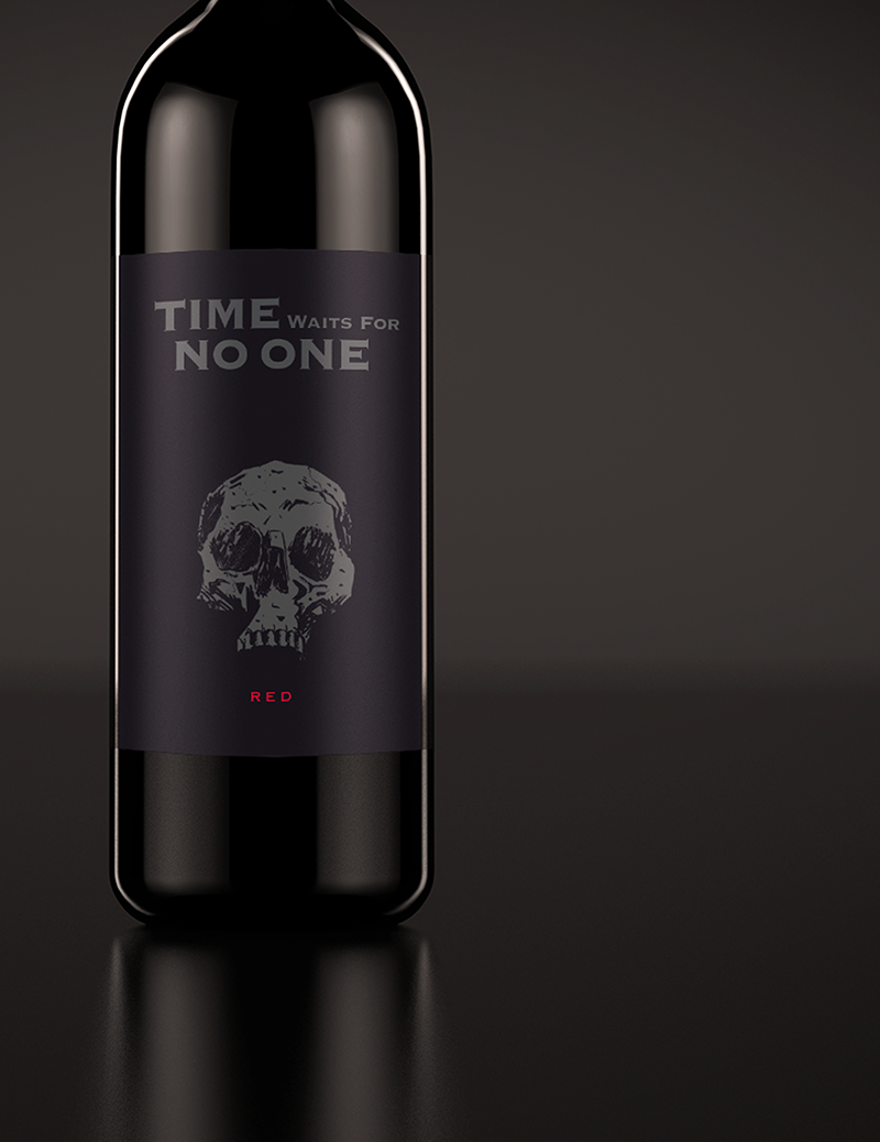
My Refresh

Process
The new design keeps the large skull, colour scheme and sans serif font from the original to remain familiar. The monochromatic colour scheme is modified to create an eye-catching design that stands out on the shelves. The darker colours reflect the theme of the label, a reminder that your life is finite.
NEXT UP

OTHER PROJECTS

Brand Identity • Folk Festival
See my theme graphics, logo and expressions for Winnipeg Folk Festival.

UX • Restaurant Website
Check out my imagined re-design of Little Goat restaurant's website.


Repair Care • Logo Design

Digital Illustration
For this assignment our goals was to illustrate a letterform with something that started with said letterform. U for Undead.

Stantec Work
See my intern work for Stantec: praposal template, internal flyers and a slideshow update.